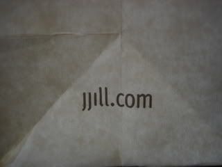
Here's a time when matching the tone and style of the brand is not the way to go. Now can someone help me? I can't seem to find all those different pipes on the keyboard and |||||.com isn't working for me??
You take the good, You take the bad, You take them both and there you have the facts of life... on the Web.

6 comments:
I disagree. J. Jill is a well known clothing company, and you would not expect their URL to be anything other than jjill.com.
Even if it looks a little pipey, can you honestly tell me that if you saw an ad for J. Jill then later forgot that the URL was jjill.com.
Come on!
I recognized the website immediately, but it's only serving its audience that is already aware of them. It won't pull in new customers that haven't heard of them before.
Point taken, Nexus Rex. But, as Anon says, only those familar with JJill will recognize it. And I'd argue that even a good chunk of those folks (my Mom, who is a JJill shopper, included) would have to do a double-take when looking at this URL to decipher it. To me, in this crazy world of ADD and instant gratification, a double-take is one take too many. You need to make an immediate and lasting impact right off the bat.
I do agree that it's not exactly ideal, but would you really advise having a domain name other than their business name? I always hate when I see a company, for example: XYZ Inc., and their domain is DurableClothing.com. I get home and want to look for xyzinc.com, and I forget their actual domain.
Not at all. I love the URL JJill.com. Just hate the way it's presented here. The characters look like pipes so it's not easy to read and instantly recongizable.
I see! That was not clear in your original post. I do agree that they should have used CamelCase and a less pipe-like font.
Post a Comment