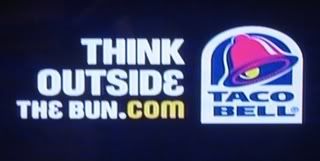
I expect URL atrocities from i-Net Sales Partners but Taco Bell?!? Even though the voiceover at the end of this commercial says "Think outside the bun," someone who catches this URL at a glance (or has their TV muted) might be thinking TheBun.com. Yo quiero better URL!


9 comments:
I thought it was just bun.com, since space isn´t allowed in an URl
Taco Bell's target demographic knows this one, I have to disagree that this is a bad url. Yeah, the sign might be bad for it, but this is a blog about good/bad urls, not good/bad signs, right?
By the way, this is a great idea for a blog. I'll be here often.
Noel - my intention with this blog is to focus just as much on URL selection as URL presentation. I have no problem with Taco Bell using an URL that supports their tagline -- in fact using YourSlogan.com is one of my best practices. They just need to display it better on signage and in their TV ads so there's no confusion.
I don't think this sign is as bad as it seems. People do recognize slogans (Taco Bell customers for that matter) and I think the white letters kind of wrap the whole phrase together... I think that if the URL was only "thebun.com" they would've put only this in yellow and "Think Outside" in white, but since the whole slogan is written in white, and the ".com" in yellow, it kind of tells you that the WHOLE slogan is part of the URL and you just have to add the ".com" in the end. At least that's the way I get it.
You mean "Yo quiero". If you don't know how to spell a word in a foreign language, then don't use it. Or even better, search for it.
@Aaron- Sweet blog, wish I had thought of it first!
@Alejandro- the fact that it took you that long to explain why it was OK is why it is not OK. You don't have the luxury of people thinking about your URL.
@Jeduan-If you want perfect Spanish, go to a Spanish site- lighten up!
Michael:
Not trying to be mean or anything but I disagree. What took me so long was trying to get YOU (visitors of this site) to understand what was going on in my mind, but it didn't take ME more than one second to figure that out. I was trying to explain the way I read the URL and that's what took me so long, not the reading process itself.
By the way, I checked out your website. I liked it, I'm subscribed now.
The funny thing is I actually went to FreeTranslation.com and typed in "yo quero" to make sure it was right and it translated into "I want." I guess that's what you get for using a free translation site. I'll update the post with the proper spelling. Don't want to make any more enemies south of the border.
@Alejandro- Wow you are a mean guy, how can you express your opinion like that ;)
That's cool. I understand that there is something to be said for target audience. A good rule of thumb is to not make people think.
Taco Bell has enough $$$ to make a mistake here and there, or take chances with multi million $ campaigns. I don't have that luxury, and imagine most of the readers here don't either.
I see people waste the few precious dollars they have copying bad marketing campaigns from big companies. I try to be a voice of reason for the little guys (like me).
So whoever is spending the money has to decide whether they picked the right URL.
This blog rocks because it puts a simple, but important marketing tool in perspective.
Thanks for the dialogue!
Post a Comment