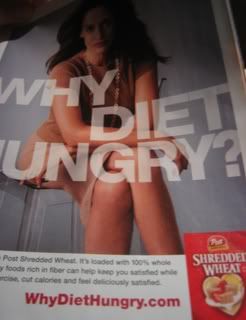
Love how they tied their whole campaign into their URL -- and, of course, presented it in a nice, clean fashion. Kinda makes you wonder... WhyDontAllURLsLookThisGood.com.
You take the good, You take the bad, You take them both and there you have the facts of life... on the Web.

2 comments:
When I see this URL, the first thing I read is Why Die Hungry?
Good point Willy. They might've been better off changing the color of the middle word to make it pop.
Post a Comment