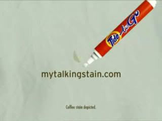
And here's when alllowercase doesn't work. I do love the font they used though. Anyone know what that is? Would've been cool if the etched the URL into the stain here. This was definitely one of my favorite spots.
You take the good, You take the bad, You take them both and there you have the facts of life... on the Web.

4 comments:
Sorry but I am going to have to say Good URL, easy to read, to the point, and is a .Com
Making the URL the stain would have been a Bad URL...
I am also with annon, i think its a good url. There is no clutter so easy to read.
No doubt I'm being nitpicky here but I still think Leading Caps Would've Helped The Three Words Stand Apart.
Im sorry but "leading caps"
is so 80's dont you think?
This is a Great URL.
Just one guys humble opinion.
Post a Comment