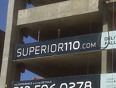
This one's just strange. That futuristic font makes all the letters and numbers run together -- especially the I that looks like a 1. And putting the numbers after the letters in a street address is not intuitive. This URL is inferior.
You take the good, You take the bad, You take them both and there you have the facts of life... on the Web.
1 comment:
Regarding your comment that putting the numbers before the street name would be more intuitive, it looks like 110superior.com goes to a duplicate of the superior11.com site--not a redirect, but a duplicate. Since the development firm is using "Superior 110" as the brand name for the building, I'm surprised that 110superior doesn't 301 redirect to the URL pictured.
Post a Comment