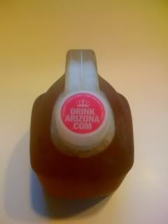
OK folks, we've got another SkewURL here and need your help rating it.
Here are Peter's initial thoughts...
"On one hand, I salute them for using a normally abandoned piece of real estate on the juice jug to promote their site.. but when it all comes down to it, I'm a big naysayer on splitting domain names by line.. Since writing the name horizontally would have been a challenge, it seems they could have easily wrapped the name in a semi-circular fashion around the top and had a more effective presentation (in my opinion).. shoot, they may have been able to wrap the domain name twice, once on the top, then once more below, then used the crown image in the middle.."
And my response...
"I think by the BIG BOLD FONT they get the point across that the 3 "words" go together but I agree that a better presentation would've been wrapping. I'm gonna let the community vote on this one."
So what do you think?


4 comments:
fugly
I think it works. Wrapping the text in a circle is a fail imo. This is the best they can do and I think people will get it.
Wrapping it might not be an option. It looks like there's some kind of legalese/safety info there already (You know, "Don't drink if seal on cap is broken."). I think they made the best use of the space they had.
I think given the size of space that the cap allows for it's good use. If it was spaced that way on the side of bus, not so much. Much better than making it 8pt font just to be on one line.
Post a Comment