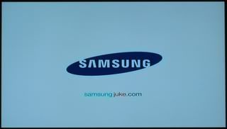
This is one time where I don't mind use of all lower case. By displaying each word in a different color, there is a clear delineation. And by using the product name that was featured in the commercial and setting it against a clean white background, it's likely that viewers will remember this URL. Rock on Samsung.


No comments:
Post a Comment