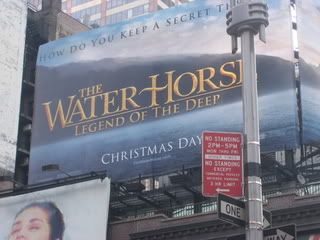
I just got back from a week in Manhattan where there are more URLs per square foot than any other place in the country. Needless to say, the key to standing out amongst the clutter is an URL that's clean, crisp, and clear. This one hits 2 out of 3 which ain't bad. The problem is that the one they miss is the most crucial in a place like Time Square -- the URL is just not clear. It's the same color as the sea and buried at the bottom of the board. In fact, I had to walk around for about 5 minutes just to get an unobstructed view. It's too bad -- this is one of the few movie URLs that has a shot at being remembered. But it's out of sight and, thus, out of mind, leaving this URL all wet.


1 comment:
Er... I can't even find it :S
Post a Comment