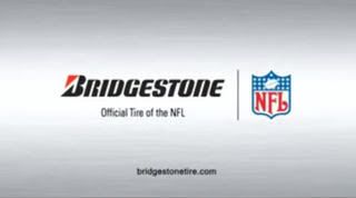
This one presents an interesting case. Let's forget about the lower case and mono-font. That alone makes this a bad URL. I quesiton whether using BridgestoneTire.com as the consumer-facing brand is the right call for these guys. Bridgestone.com is the global corporate site with links to their companies in various countries. Assuming tires is their flagship product and the US is where they generate most of their revenue, why not let that segment carry the friendlier URL? Admittedly, I don't know enough about this company to know if that's the case but they put their SuperBowl millions towards promoting this one line of business so I'm guessing it's pretty important. My thought is the corporate site should get the harder to remember URL -- maybe BridgestoneCorporate.com. Any thoughts from the peanut gallery? Should this URL be retired?


1 comment:
Yah its pretty bad, not cachy,not friendly, it got no ring, and it is SINGULAR. At least they could put tires. Tire? wtf, makes no sense, no one is going there for one tire. I dont know much about cars, but i do know they have more then one tie.
Post a Comment