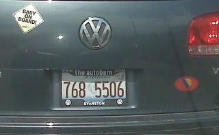
Here's one of the few times I don't mind the use of dubs and all lower case. The layout and spacing just seem to work, framing the lisence plate nicely. Those little tabs at the top appear to have been made specifically to house dubs and coms. And the space between "the" and "autobarn" allows the separation needed so the words don't run together. What I really like here is that the brand name is set off a bit so it is recognizable independently of the URL. In other words, those who want to know where the car was bought can immediately find out and those who want to find out more about the dealership and take that extra second to look at it will realize it's the URL as well. The guys who came up with this one, clearly weren't born in a barn.


2 comments:
I dont't agree on this one. You have to look really carefully to notice there's an URL there.
I hear you Parker. My guess is that first and foremost they want you to see the name of the dealership, not the URL. With such limited space on a lisence plate, doing it this way ensures that the name stands out. Then you may as well use those little tabs rather than leave them blank so they insert the dubs and com to hit their secondary objective of relaying the URL.
Post a Comment